Reflection
In my previous experience with text-to-speech tools I’ve found them bland. Although I did pay better attention to accents other than my own (Canadian/American), I am more of a visual learner and don’t tend to absorb things from hearing them alone. To remedy this I tried reading along with the text while listening to the audio, however I can read faster than the models can speak so I often end up reading ahead with the audio becoming a background as I focus on the text. Recently, a new text-to-speech tool has been released and I find it much more engaging. It’s called PDF to Brainrot, and in spite of it’s humorous name, it’s a legitimate educational tool, setting pdf lecture transcripts to fun visuals as well as displaying the text on screen as it is read. This tool helped me because the text is displayed as it’s read, preventing me from reading ahead so that I can better absorb the information without diverting my focus towards speed. The visuals in the background also provide me with engaging stimuli to look at without diverting my attention from the lecture.
Infographic

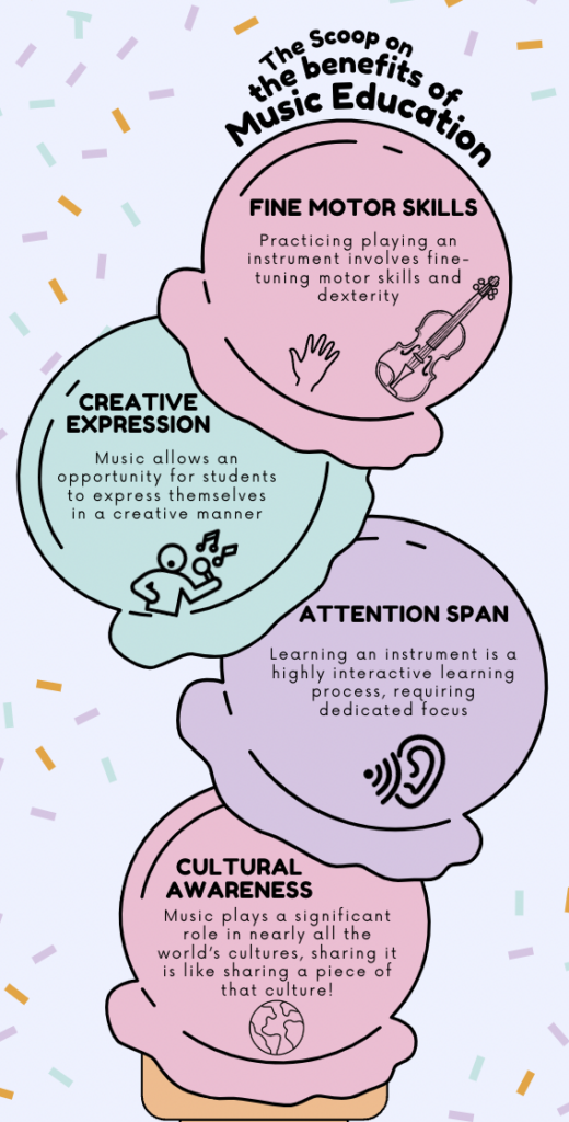
While designing my infographic, I utilized a template which provided a fun theme to grab readers’ attention. I used headings and bolded text in order to highlight and increase the contrast of these features, thus drawing the reader’s eye towards these main takeaways. I also chose to have one main subject with four supporting points, keeping under 6 elements to employ Cognitive Load Theory. I used small blocks of text along with relevant visuals in order to leave some empty space and not overwhelm viewers, and I chose a theme that allowed me to create clear sections to break the information down into smaller, more processable, segments. I was grateful for Canva providing templates because it inspired my decision on theme and it creates opportunities for the less artistically inclined to still express information in a visually effective manner.
Wave Report

Since I thought that my first post was poorly organized and looked like one large block of text, I chose to put my second post through the wave analysis. I was grateful to see that it revealed no errors, and that my contrast errors were not in content, they were all flagged on links and other such features, suggesting that I creating a visually effective post! I plan to continue using Wave to review my content an insure that it is accessible and organized.